Mobility as a (more inclusive) Service
/Technology can play a large part in making travel easier to plan and book but it has to work for everyone. Go Upstream worked with Tactran, a Regional Transport Partnership in Scotland, to explore how inclusive their Mobility as a Service (MaaS) apps are. In a nutshell, our groups proposed some improvements, many of which have already been incorporated. Conversations about our journeys has also helped us understand how change can happen.
Planning a journey can be complicated. How do we easily find and organise the information to help us choose the right type of transport, the best ticket, the right route and the most convenient connection? What else do we need to know before we decide?
Technology can play a large part in making this easier but does it fit with our real lives and the real journeys that we take? This is what Tactran has been aiming to find out.
Tactran is the Regional Transport Partnership covering the heart of Scotland's transport network, covering the local authority areas of Angus, Dundee City, Perth & Kinross and Stirling. Working with technical partners Fuse Mobility, they have been developing Tactran Enable, a journey planning and booking platform which powers three services aiming to support passengers in the region to travel confidently and sustainably.
Tactran and Fuse have been working with partners in NHS Tayside, Dundee and Angus College and Loch Lomond and Trossachs National Park to consider how such a service could help people to confidently travel to their hospital appointment, make it to their lecture on time or plan a day out in the countryside.
In late 2021, Go Upstream developed and hosted a series of workshops with disabled people and students to explore the use of the Tactran Enable platform and one of the services in particular - the GoNHS Tayside web app. Working with 24 people over the course of 5 workshops we considered how GoNHS Tayside can support them now and how it could be developed to provide further support.
We learned a lot.
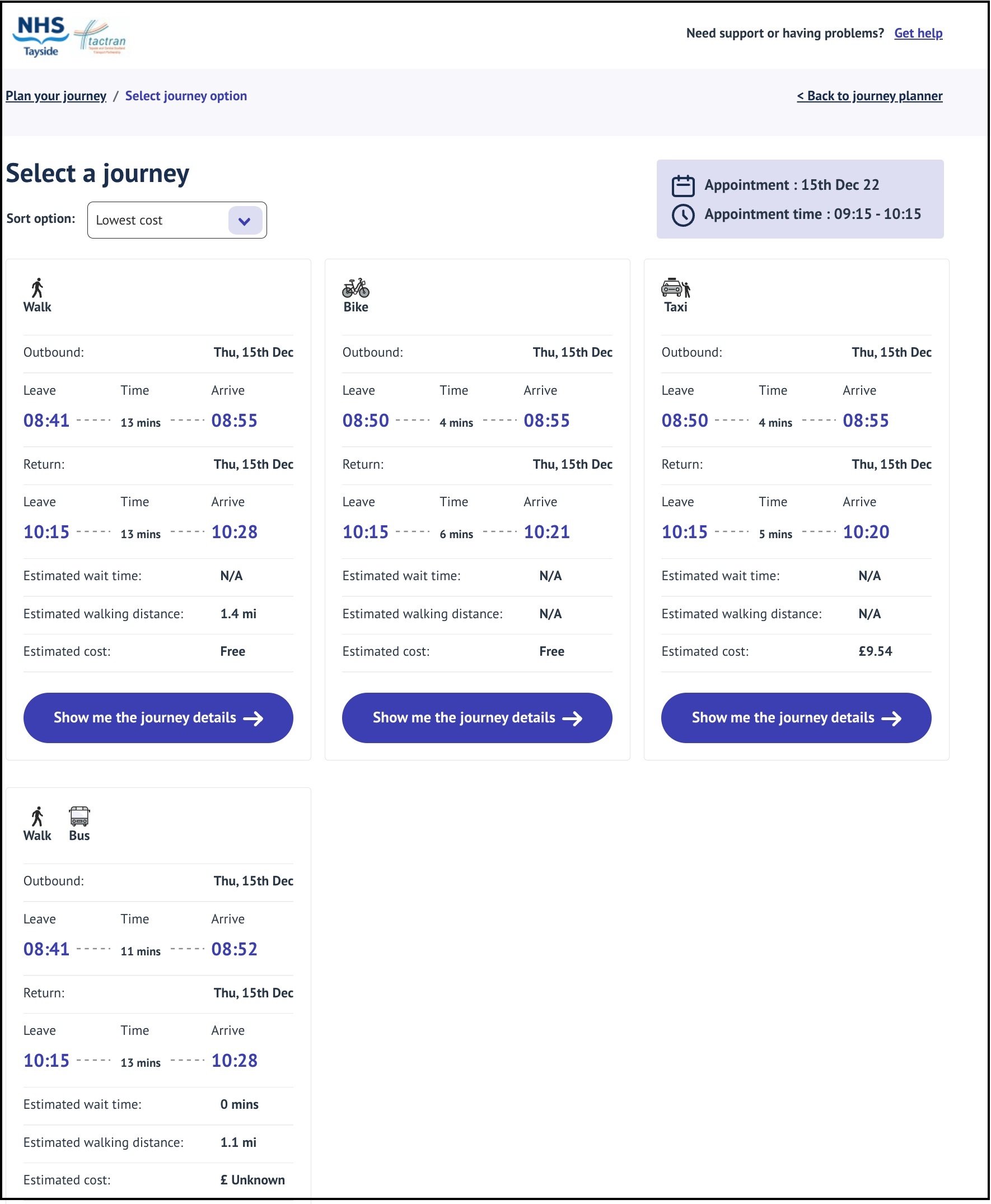
GoNHS Tayside already helps to reduce the complexity of journey planning. Take a look for yourself and you’ll see that it provides different transport options including some that you might not expect such as cycling and even community transport. By showing how the different operators can ‘fit together’ to make up a journey, people felt that the app can take the work out of looking in multiple places and stitching the information together ourselves.
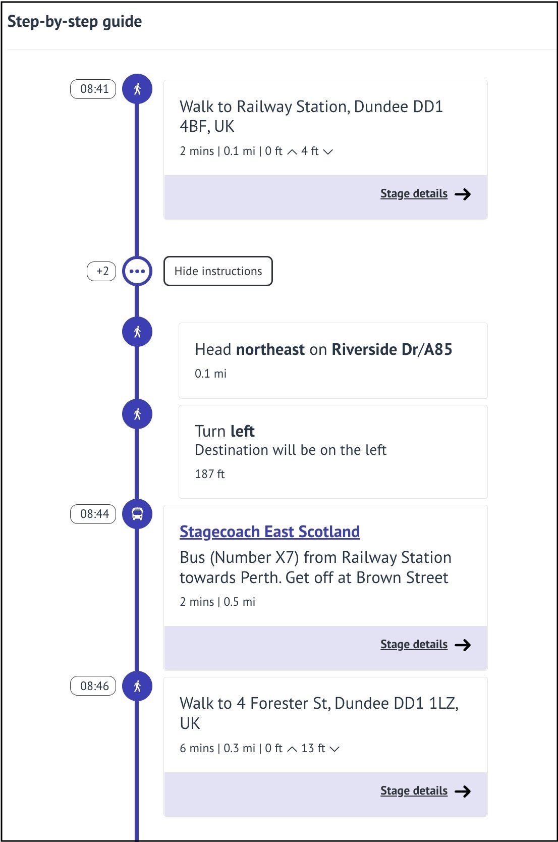
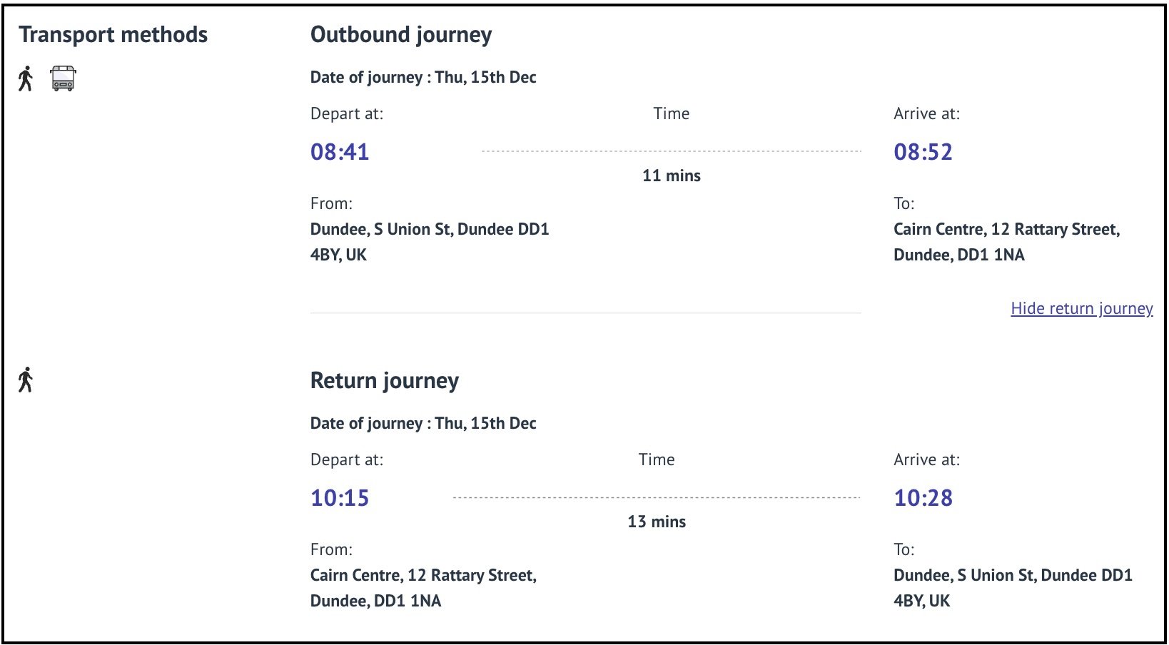
Our participants told us that good information can provide reassurance and really liked the fact that the app shows an entire return journey, broken down into its different elements. The ‘step-by-step guide’ brings all the information together in one place - we could imagine the journey, a bit like trying it out without leaving our house. For example, we considered attending a hospital appointment and by changing the length of our appointment time we could see how that would change our transport options.
Participants liked the fact that GoNHS Tayside provides different transport options and combinations - such as taking the train to the destination and catching the bus back again. It reflects real life, we don’t always use the same transport to get there and back.
Of course, all of these features depend on access to the internet but, as our participants pointed out, the app potentially offers non-digital support because journey options can be printed and taken with us.
This prompted some really interesting conversations about what information we need before and during a journey. It might be the same information but perhaps we need it in a different format and in real time. Have I missed the bus or is it running late?
So, Tactran’s approach was generally welcomed. It does the hard work of bringing together a lot of the information we need to start planning a journey. Of course, it can always be improved. We held two further workshops to look at improving the ‘look and feel’ of the app and the different ways in which language and icons could be better used to help people navigate - both through the service and through the world.
We also identified that it could include more information for all three services that would provide reassurance and make it easier to navigate as far as the clinic reception desk, the park’s visitor centre or the lecture theatre. Good information about toilets, spaces to rest and shelter, safe crossings and clear routes would make our journey plans more realistic and add even more value to using the app.
Near and Far planning
Thinking about this type of data takes us beyond the usual conception of “journey planning”. By working alongside people we discover what type of information will really support people to make a successful journey and evaluate different travel destinations. Toilets and places to rest are unlikely to feature in current planner apps and yet these are a crucial part of planning a route for many. We also found that there is real value in designing these tools to help people evaluate what to do and where to go.
We started to call this “far planning” - information that we need days or weeks ahead when we plan our trip. Many people use this to consider a range of options in the future – not the immediate journey for today or tomorrow. The Loch Lomond and Trossachs National Park app incorporates an “explore” function which is helpful for this.
And then there’s “near planning” which is information we need in the moment, on the journey itself. This includes changes and updates (My bus hasn’t arrived so I’ll need to get a later train - I need to phone the assistance service to let them know).
Designing with not for
As ever, while learning how we can use a particular service and suggesting improvements that could be made, we also began to consider how the expertise and experience of disabled people is central to the development of these types of tools in the future. With the rising use of technology in every aspect of our journeys, we need to ensure that digital services are created with everyone in mind.
Towards the end of Go Upstream’s involvement in the project, we organised a review event which brought together project partners, Transport Scotland and Local Authority staff as well as some of our workshop participants. We reviewed our process and discussed our findings.
We took a step back and discussed how we can generally approach this type of work - we drafted some principles together that can be applied to development of more inclusive digital journey planning.
Design for simplicity - avoid taking people in too many digital directions, it’s easy to get lost in a process. Consider when someone might need particular types of information and when they should be asked to input information.
Think beyond the transport - consider the journey context and its purpose not just the journey itself. Discover what type of information will support people to make a successful journey.
Consider what ‘accessible’ means - when we design with people we understand what their journey really looks like and discover the information that will support someone to travel confidently - then we can worry about the ‘nuts and bolts’ of accessibility (font size, colours, navigation buttons…). Incomplete information made ‘more accessible’ is still incomplete information.
Don’t hold consultations, build relationships - co-design is a process not an event. Plan to involve people early and throughout your process. This is important in both continued improvement of the service but also in disseminating the service into appropriate networks to foster uptake and use.
Valuing and acting on what we learn
So what’s happened as a result? Well, some of the group’s suggestions have already been incorporated into the app.
Layouts and features have been improved for better screen reader compatibility and clarity
Suggested journeys have been filtered to propose more realistic options
Text has been simplified and symbols used where appropriate
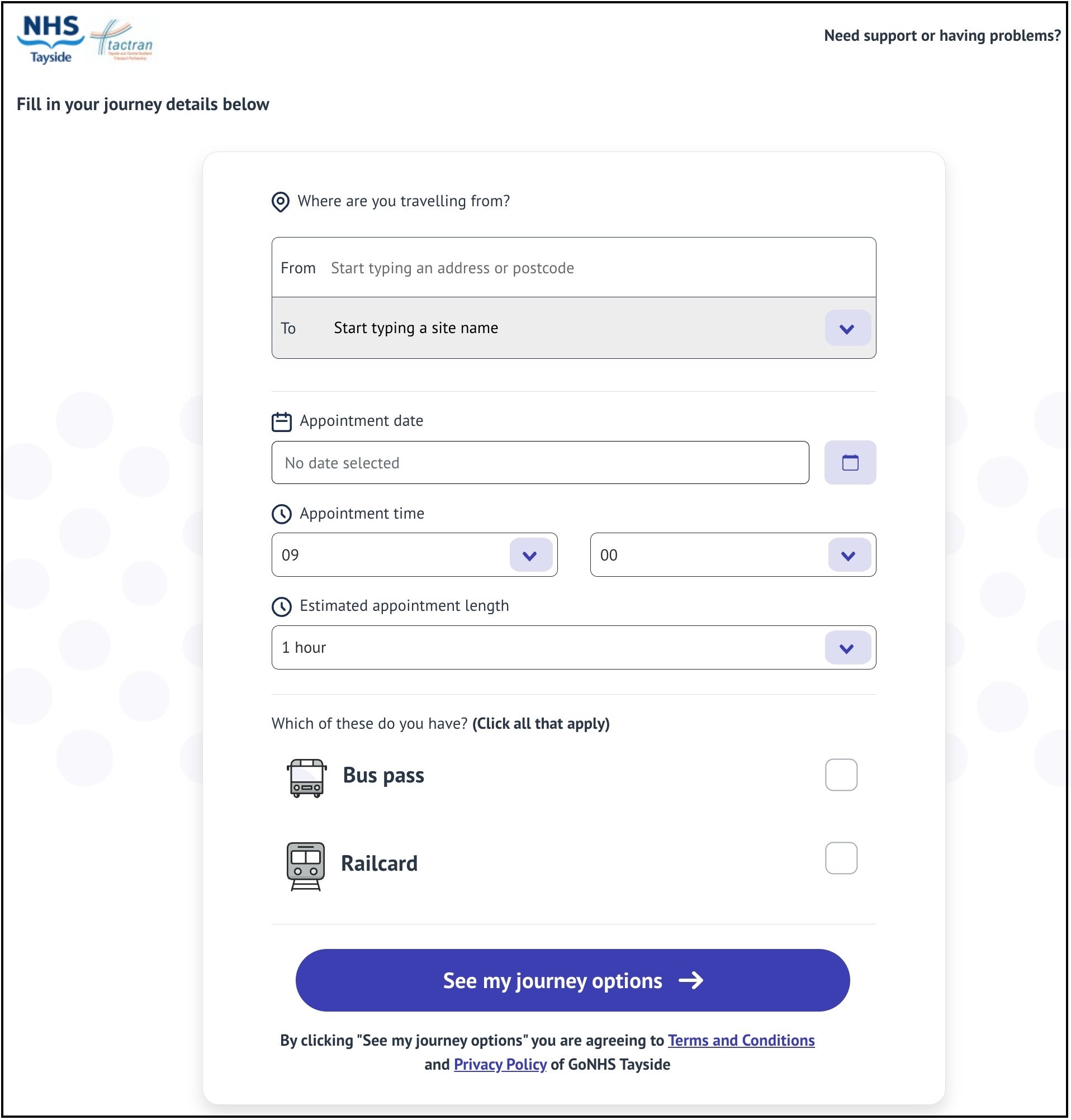
As ever, some of the most effective changes are the smallest. Two features on the home page were quite confusing to our participants. Removing one and simplifying the other has made it easier for people to quickly search for journey information with no impact on the quality of the results.
The ability to change the length of your appointment to get accurate journey information - which is a really useful feature - is now on the home page which is more sensible.
All of the changes made, and still to come, happened because we (virtually) sat next to people and spent time understanding what their priorities are on a journey, what they need and how best to take people through a process.
Steve Cassidy from Fuse Mobility reflected on the process:
“As a software supplier working in mobility / Mobility as a Service(MaaS) we have learnt such a lot from Go Upstream’s work. Our MaaS tools have all been built on extensive co-design with user groups but there is nothing quite like sitting alongside someone using the product you have created! Go Upstream highlighted specific issues - great for the product we are creating - but also contextualized any issues in a really engaging and positive manner - great for the service we are creating. The multi stakeholder workshops were so helpful (and enjoyable!) for the project, touching on governance of services, marketing and awareness raising and branding. These are so often overlooked in the MaaS world”.
Hussein Patwa, accessibility consultant and workshop participant considered the updated site and commented:
“It’s great that Go Upstream group’s feedback, based on disabled users’ experiences, has been acted upon: the NHS site is easier to use and is a giant leap forward for accessibility and easier access to health services in Tayside. Great job.”


